Sep 22, 2025
Elevate your dashboard’s story with new visual components
Julie Sylvest

At a glance, one akenza dashboard tells the whole story.
With recently added features such as the new signage screen mode and updated chart component, you can explore richer ways of visualizing and interpreting your data. Use them alongside existing components for deeper insights into your assets and facilities.
Keep tenants informed with the new digital signage screen mode
The new digital signage screen mode lets you create eye-catching visualizations built for signage displays. This is perfect for showcasing large information panels in communal areas, lobbies, or building entrances. Customize layouts, styles, and content to suit your facility’s needs. Everything automatically adjusts to fit various screen sizes and orientations.

Take charts to the next level with the updated chart component
The chart component is updated with powerful new features while remaining fully compatible with existing charts. You can now visualize trends and patterns with even greater flexibility with support for multi-axis displays, bar and line stacking, manual axis min/max settings, axis name labeling, and line smoothing controls. Configurable thresholds make it simple to highlight key insights directly in charts.

Dual-axis setup to display temperature and humidity with individual axis scales

Stacked bar chart to display absolute desk usage per floor

Stacked area chart for cumulative energy consumption

Stacked bar chart combined with a line chart, separated on two axes
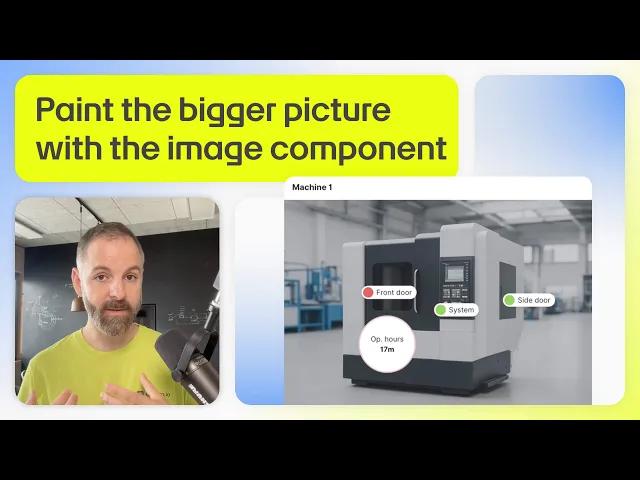
Let visuals do the talking with the image component
The image component lets you pin data to specific objects within an image. This makes it easier to visualize critical information in context. It supports pixel images (JPEG, PNG) and vector images (SVG), as well as a variety of marker styles and sizes.

This component highlights zones, sensors, or equipment in buildings and industrial environments. Display key information such as equipment status, energy consumption, or maintenance alerts so you can focus on what matters most.
It's especially handy for displaying sensor data in context. Instead of analyzing raw numbers or charts, you can easily understand what's happening in your facility by viewing data directly overlaid on a floor plan, equipment diagram, or site map.
See it in action below!
Bring data to life with the 3D floorplan
The 3D floorplan lets you build highly customizable representations of your facilities, whether it’s a single floor or a multi-story complex. Visualize and manage key facility data with support for three different “data layer types”: rooms, desks, and sensors. This means that you can "paint" your rooms, desks, and floors in different colors, depending on your IoT data.
You can combine up to five of these data layers into a 3D floorplan, making it easy to support multiple use cases simultaneously, such as desk & room occupancy and indoor air quality.

Build personalized dashboards for any use case
You can pair the updated chart component, image component, and 3D building twin with other Dashboard Builder components on akenza. This brings your most important KPIs and visualizations together in one cohesive view.

Mix and match various components to support countless use cases:
Map: Monitor asset locations in real time.
Status: Translate device data into different states of a value. You can assign descriptive text and highlight messages with corresponding colors, making it ideal for monitoring air quality, noise levels, or machine status.
Performance: Track key metrics as percentages or ratios of their maximum values. This makes it ideal for visualizing occupancy rates of a building, current desk availability, and fill levels of waste bins.
Gauge: Display measurements within their defined range, clearly marking thresholds and critical values. The bar is colored based on the thresholds you define and is useful for monitoring machine conditions, fill levels, and occupancy rates.
And many more…
You can group components to keep your dashboards organized both visually and logically. Grouping allows you to move multiple components as a single unit and also scale them collectively. This makes it faster and easier to resize and adjust entire sections with just one action.
Discover all the dashboard components on akenza with our 30-day free trial.
Stay up-to-date with the latest features at akenza on our Changelog.
Discover other blog posts


Need help with your IoT project?
To learn more about how akenza can help you build smart solutions with ease, contact us or directly sign up for a free trial today.
Changelog
If you want to follow the latest updates and upcoming features of akenza in real-time, be sure to check our changelog.